iPhone/iPad Calendar Bug Report

Always irks me that the Mac OS X, iPhone and now iPad thinks that Singaporeans start their week on Sunday instead of Monday. I was finally motivated enough to submit a bug report last week, and in less than 2 days I received a reply from Apple for a followup on the issue. Pretty impressive for a big company like Apple. The last time I got a direct response from a tech company for a bug report was from Omni Group for their OmniOutliner software.

If you’re keen to read the report, see: Bug Report for Calendar in iPhone & iPad

“Ridiculous” to optimise sites for iPhone

Rob Haggart of the blog A Photo Editor and professional photography portfolio software A Photo Folio, wrote in 2008:

A reader asked me awhile back about optimizing websites for the iPhone which I immediately dismissed as ridiculous and then, what do you know, I was out of the office later that day and tried to access a photographers contact info by going to their website on my palm phone because I didn’t have it in my database and couldn’t do it because of the flash so I thought ok, maybe there’s something to this.

In the larger scheme of things nobody will ever receive or lose a job based on the ability of their portfolio to render on a palm phone or iphone but more and more I find myself using google as a phone book instead of carefully entering photographers contact info into my database like I used to do.

Today, A Photo Folio portfolio sites support not only the iPhone (albeit rudimentary), but is boasting to be the first to deliver iPad sites on their portfolio.

Given the popularity and ubiquity of the iPhone among editors, art directors and clients, it is possible that you will receive or lose jobs based on the ability of your portfolio to render on the iPhone/iPad.

Earlier today, Kottke points out the fact that the websites of the top 10 luxury brands don’t work on the iPad reflect poorly on the industry, and that “If I were Anna Wintour, I would be screaming at these companies to fix these sites”.

I don’t know if Anna Wintour is using an iPhone or an iPad, but I’d bet it’s one of the many smartphones—of which none of them supports Flash.

Aperture 3: I’ll Pass

No tethering support for Canon 5D2, or for that matter, any Canon cameras newer than the 350D.

Even the inelegant workaround, the Hot Folder Import Script doesn’t work. And even when it does, it is still more clumsy than Lightroom 2 or Lightroom 3’s implementation of Auto Import, requiring an additional script to work.

As much as I want to like using Aperture (hell, it’s almost S$200 cheaper than Lightroom 3), I’m going to have to pass.

Safari: Open all “new window” links in tabs, and other tips to replace Saft

Predictably, my Leopard copy of Saft no longer works on Snow Leopard. A new version was released today but it does not support native 64-bit mode Safari under Snow Leopard. There’s currently no upgrade option for Leopard users to Snow Leopard versions of Saft, and I’m not keen on paying the full US$15 for a version that does not work with 64-bit Safari in Snow Leopard.

This is not the same as making links that opens a new window to open in a tab

This is not the same as making links that opens a new window to open in a tab

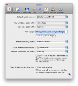
There are a few things I truly missed from Saft, including making those pesky links that force open in new windows to open in tabs instead. Note that this is different from the option under Safari’s Preferences > General to “Open links from applications: in a new tab in the current window”.

For example, my university’s (NTU) website has a habit of irritating the hell out of us by opening just about everything in a new window. Try it, search for something, boom, a new window appears. Click on the link to the library’s page, and boom, a new window opens.

Fortunately, this can be dealt with without paying for or installing any additional software. You just need to quit Safari totally (Cmd+Q), open up Terminal from Appplications/Utilities, and key in the following:

defaults write com.apple.Safari TargetedClicksCreateTabs -bool true

Launch Safari again, and no new windows shall ever bother you again. Meanwhile, I’m still missing the following features that I’ve grown to depend on from Saft:

  1. autosave-last-viewed-websites-on-quit-and-restore-on-startup. To be fair, you can get around this by going to History menu > Reopen All Windows from Last Session, though you would have to do this every time you launch Safari,
  2. undo when you accidentally closed a tab or page (no workaround now),
  3. drag scroll a page by holding down the Control key and flicking the mouse (something I got too used to and it’s bugging me that I can’t do it now).
  4. type ahead search

Signs of bad Mac software

Follow up to my previous post on tell-tale signs of bad Mac software before you even use it.

Five minutes into using Canon Digital Photo Professional (DPP), converting some RAW files into JPEGs and TIFFs, I saw this dialog that I had no idea how to close.

Terminate?

On most sane Mac software, I could have just clicked on the red button on the top left to close this box. But not in DPP because the developers have disabled the close button.

I had to pick up quite a bit of courage to try the “Terminate” button.

Signs of bad Mac software (before you even use it)

Restart computer

I’ve been avoiding the Canon provided software suite, including the Digital Photo Professional (DPP), like a plague. I’ve seen how my friend struggled with the interface, and It always seem like a piece of unpolished software. Today I decided to install it to compare the RAW outputs with Lightroom. True enough, even before I get to use the software it already reeked of a bad Mac software.

Here are some tell tale signs of a real lousy experience to come.

  1. Requires running an installation program
  2. Installs icons in your dock without your permission
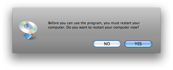
  3. Asks you to restart your computer when the installation is done

For some of the more complicated software such as Adobe suite and Microsoft Office, where some files (such as fonts) need to go into places other than your Applications folder, I think it’s understandable to have an installation program.

No reason for number 2 to happen though. With Microsoft Office you can prevent it from happening if you customised the installation option. But not with DPP. It’s just plain rude to vandalise my dock this way.

And what’s with the you-need-to-restart-your-computer thing? Hello, I just installed a RAW convertor, not updated my OS.

Safari 4’s tabs and the Wacom tablet

John Gruber’s complaint of the new Safari 4’s tabs is right on money:

Consider: with the previous tab design, if you wanted to move a window you dragged the window, and if you wanted to move a tab, you dragged the tab. Now in Safari 4, if you want to move the window you drag a tab, and if you want to move a tab you drag the small grippy strip at the far right edge of a tab.

If you’ve used a Wacom tablet before, you’ll know that clicking with a tablet pen is never a precise thing.

With a mouse, movement of the cursor is entirely separate from clicking—you move the cursor by shifting your hand and click by pressing the mouse button. With a tablet, you need to place the pen tip onto the surface of the tablet, and lift it off the surface to trigger a click action. The problem with a tablet is that unlike the mouse button, the cursor shifts when you lift the pen off the surface of the tablet.

If you’ve never used the tablet before but have used the iPhone, this problem is similar to how the text selection caret shifts slightly as you lift your finger off.

In my experience, Apple is clearly aware of this problem, and corrects for the minute shift through the iPhone software by putting the caret back to where it was before you lifted your finger.

With the Wacom tablet, this does not happen. And since Safari 4’s tabs are now very sensitive to the dragging action, the imprecise clicking of the Wacom tablet now drags the entire Safari window instead of selecting the tab.

Very annoying. I had to revert Safari 4’s tabs back to the old style for it to be useable again with my Wacom tablet. See tip for on Lifehacker for Putting Safari 4 Beta’s Tabs back.

Hands on the iPhone 3G

This article first appeared in the Nanyang Chronicle, Vol 15 No 3.


For a smartphone, the iPhone is probably quite dumb by today’s standards.

It doesn’t allow you to copy-and-paste text, forward text messages, search through emails, record video, share files via Bluetooth, send multimedia messages (MMS), edit Office documents, and the list goes on. It has no hardware keyboard, no removable battery, no way to expand the memory, no support for Flash files and only a two megapixel camera.

Some of these deficiencies are startling and enough reason to keep some users away from an iPhone completely. But why would thousands of others queue at SingTel’s ComCentre on the midnight of August 22nd nevertheless, waiting some three hours to get their hands on the iPhone?

It’s all about style

There is no lack of reviews on the iPhone everywhere. Most of them, however, tend to focus on what the iPhone can or cannot do. But just like the iPods, the iPhone really is about doing things with style. Style is after all the reason why iPods are the best-selling portable music players around despite costing more and doing less than its competitors.

In the case of the iPhone, style is defined largely by an intuitive and consistent interface: intuitive because you navigate it with thumbs and fingers on virtual buttons sized comfortably for use; consistent because the same swiping, pinching and tapping finger gestures work throughout the entire iPhone operating system and its third-party applications.

Style is not about looks and feel; it is really about how things work. Examining the oft-dubbed “iPhone killers” for instance—the Samsung Omnia and the HTC Touch Diamond—reveals that there is no shortage of eye candies.

Although both phones have attempted to emulate the iPhone by allowing users to scroll through their custom interfaces with the swipe of a finger, such behaviour is not consistent throughout the entire phone.

The problem arises when users are thrown out of these custom interfaces, which are no more than application launchers, into native Windows Mobile applications. At which point, finger swiping no longer works and buttons return to their standard miniature sizes that are more suited for the pin-point precision of a stylus than for use with fingertips or thumbs.

In contrast, because the iPhone was designed from the start to be used entirely with fingers and thumbs, every aspect of the its interface works well and naturally without the need for additional input devices (the Diamond includes a stylus and the Omnia an optical mouse).

It’s about what you do

Web surfing is probably the greatest strength of the iPhone. Several of its features make surfing on it feasible and enjoyable: First, the bright, large and high-resolution screen displays text clearly and crisply; second, the swiping and pinching finger gestures allow for quick and natural navigation of webpages; and third, the built-in mobile Safari browser displays webpages quickly and accurately.

The caveats are that the iPhone’s browser cannot handle Flash (which locks you out of most web videos, as with the Omnia and the Diamond) and Java (used mainly for internet banking and some payment services).

But for just about everything else the iPhone surfs the web as well as a computer. You can access most of the university’s web services, such as StudentLink, Edventure and WebMail. Outside campus, having the internet available at your fingertips everywhere can save you the agony of wasting money on a bad product or a lousy movie.

A case in point: a day after I bought the iPhone, I went shopping for a protective case. Unsure which case out of a dozen different brands was better, I took out my iPhone, launched Safari, checked out the best-rated case on ilounge.com, picked it up and went home a happy customer.

Fix for the email addicts

I am a self-confessed email addict. Most of the time though it is not because I enjoy obsessing over them, but because how quickly I am able to respond to some emails can mean whether a last-minute story is covered in the Chronicle, or whether the editorial team gets to go home for dinner or supper on Friday of production week.

Setting up Gmail to work through IMAP on the iPhone is a breeze. It is a shame though that the university’s web mail server does not support IMAP when NUS, SMU and other major universities do.

No discussion of the iPhone emailing capabilities is complete without talking about the its touchscreen-only keyboard. Co-chief executive Mike Lazaridis of Research in Motion, the company that makes the BlackBerry, was quoted April this year in The New York Times, saying: “I couldn’t type on it and I still can’t type on it, and a lot of my friends can’t type on it. It’s hard to type on a piece of glass.”

Like Lazaridis, I thought I would have hated the iPhone’s keyboard. But I ended up liking it. Sure I make mistakes on it all the time, but the auto-correction technology works so well that I can type close to 40 words per minute on it using both thumbs now.

Ironically, for the amount of aversion the BlackBerry-maker has towards the iPhone’s keyboard, I found the lack of a real plastic keyboard a blessing in disguise. Because there’s no real buttons to press, typing requires minimal effort and results in no sore thumbs after typing a long email.

For the hopelessly lost

Finding your way around the built-in Google maps application with the scrolling, pinching and double tapping gestures beats flipping the street directory any day. And when you do make a wrong turn somewhere and find yourself lost, the built-in GPS of the iPhone 3G can locate you on the map most of the time in a matter of seconds, from which you can have the iPhone plan a route to your destination.

Surprisingly Google maps can locate precisely whatever address you throw at it, as long as a block number and street name is included. Searching for companies and restaurants is more of a hit-and-miss affair though since Google maps does not have a comprehensive database of businesses in Singapore yet.

The million dollar question

The iPhone, 3G or not, is far from perfect. Features-wise, the new iPhone continues to suffer from some serious omission of features, some of them so basic in handphones today that the question is inevitably raised of why a state-of-the-art phone can be so primitive in some areas.

Performance-wise, the new iPhone 2.0 software no longer runs as smoothly and stably as its older counterpart. Some parts of the phone now feel sluggish, particularly when searching through contacts. Some applications crash every now and then, and the phone itself hangs or restarts randomly once in a while (mine hung once and restarted twice in the three weeks of extensive use).

The iPhone 2.1 update released last Friday promises to fix all these, but until more testing is done, it remains to be seen if all the problems will be fully addressed.

For a smartphone that does a lot more, I have highlighted only three functions that the iPhone does exceptionally well in. These alone, along with the phone features of course, would have justified the price of the iPhone for me.

But for others, it could have been the iPod within—which I also use and like but did not write about in this article—having YouTube on the go, or the many third-party applications that are available to install right on the iPhone.

The iPhone is great for people who are literally addicted to the internet, want to get work done on the go and appreciate good style. For me, the two-and-a-half hours of travelling time daily can now be spent working on drafts for the Chronicle or just surfing the web—that and listening to music. Even queueing for food in canteen B becomes bearable.

But if you’re one of those who are even considering not taking up a data plan with your iPhone, you are better off spending your money elsewhere—the iPhone is about having the internet with you everywhere.